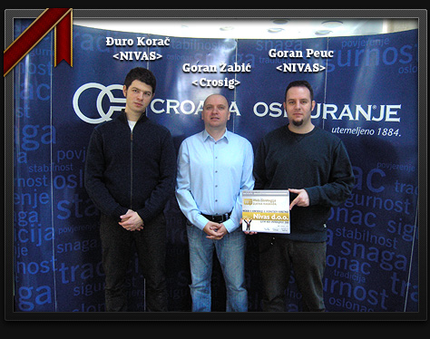
Croatia Osiguranje website won gold

At this year’s “Web Strategy” conference, organizers handed out the reward for the most usable site in the region. If you ask me, usability of the site equals the greatness of the site, since users can actually easily find their way around the site, get all the information with ease, and never feel confused. Therefore, in my view, the most usable site is the best site. And what would you know, Croatia Osiguranje – www.crosig.hr – was declared to be the most usable site in the region.
The site features tons of smart used technologies, starting with the nicely masked tag cloud on the homepage + live search, awesome implementation of Google maps, bunch of data neatly presented, and more. There is an idea to make the “making of” demonstration page to illustrate details and how were they produced, we could do that soon.

We are glad that the market recognized the blood and sweat that was poured into creation of this monstrous project. Stay tuned, as we are currently producing more digital awesomeness that you, the people, will love to love & use.


9 thoughts on “Croatia Osiguranje website won gold”
March 6, 2009 at 17:47
gratz guys!
March 6, 2009 at 18:13
Congrats!
March 7, 2009 at 11:45
congrats!
March 8, 2009 at 13:18
Čestitam! :)
March 9, 2009 at 14:54
congrats!
March 9, 2009 at 17:00
w00t!
March 16, 2009 at 18:58
Svaka čast dečki!
March 17, 2009 at 18:57
where’s that beer!