Ha! ArtLebedev made a mistake!
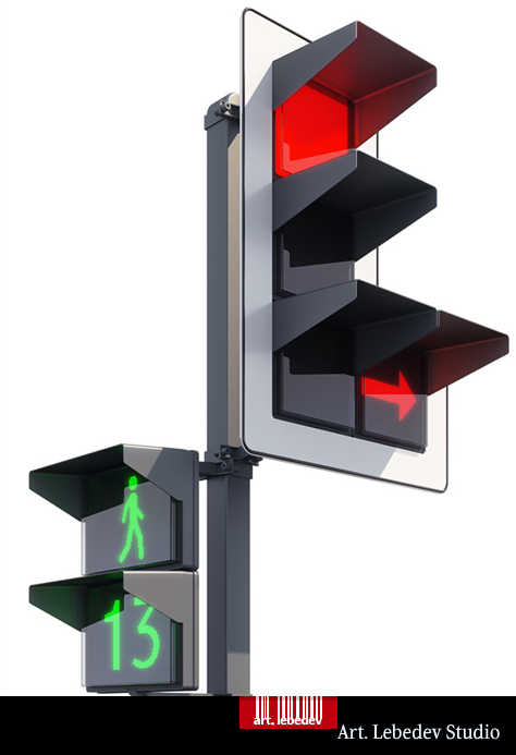
Russian crazy design studio that i have been stalking ummm.. following for years, Art Lebedev made concept on how to improve traffic light systems. Following their traditional naming system, the name is Luxofor, and on the first glance it is an improvement.

However, when you think about it, it is actually not an improvement.
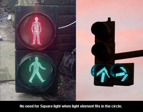
You see, most of the surface will NEVER be lit anyways. The pedestrian crossing has human figure and numbers, and on most lights in my city, there are arrows – never solid color for directions. Even if the traffic directed is STRAIGHT the light is not solid block of color, it is an arrow pointing upward.
Basically what ArtLebedev made is a huge square and then small arrow in the middle. There is so much wasted space there. That is why circle is better, arrow covers same area, only requires much less material to display.

Making lights square just increases the materials needed to build them, makes them bigger targets for hailstorm, makes them heavier, and all that which comes with increased size.
Furthermore, ArtLebedev’s proposition to have red light for right/left turns, is also not an improvement. Drivers understand that if NOTING is lit, then they cannot turn. When green lights up, they can go. Imagine if when you turned off your TV – the screen remained lit with big sign telling you “The TV is now OFF”. It is just not necessary – simply because you can see that it is not working, you do not need additional proof telling you that it is not working.
Despite this, Art Lebedev is still my favorite product design studio.


5 thoughts on “Ha! ArtLebedev made a mistake!”
November 25, 2008 at 18:08
Pardon for the intrusion, but I have a strong urge to say a few things, for completion’s sake :)
I think you might’ve (kind of) jumped the gun when it comes to the “turn-right” thingy.
You’re forgetting the fact that in the USA (and some other places on earth), you’re actually allowed (and required!) to turn right even if the sign for passing straight across the junction is currently red.
In such places, only if it’s explicitly stated (either by a red turn-right signal, or by a “no turn on red” sign) are you to fully stop on a traffic junction (if you were planning on turning right). The idea probably being that it speeds up traffic.
The software powering these (and you got to admit they look a lot sexier) can easily be told that a specific unit should operate in “no turn on red light” (as is the case in the picture above) or “allow turn on red” mode, in which case the “go straight” square (the uppermost one) would be red, but the turn-right arrow would be green, and make a lot of sense.
So, it might be that they’ve just presented a design that works for those cases you forgot about :)
As to the materials and costs of building these babies… I don’t have a feeling it’d be more expensive.
Producing squared items (of any material) seems cheaper than producing the same item in oval or circular shape (using the same material). It simply requires more time, since curves require a more detailed approach and usually involve at least one extra step in the production process. Who knows — maybe what they save in diodes not being lit for the whole circle, they loose on creating the circular shape? :)
Calculating an accurate difference in production costs (of these vs regular traffic lights) would sure be a fun thing to do for someone with some spare time on their hands :)
November 25, 2008 at 19:16
For USA:
If you can always make right turn, then there is no need for electric signal telling you that, right? In those rare cases that it is forbidden to make right turn, it is more a) failsafe and b) economical to just place “hardcoded” sign telling “No turn on red”.
I total, you never need Red Turn Arrow, simply because if Green arrow is turned off, you cannot go.
As for the square vs. circle – i firmly believe that round glass is not made by making it square and then grinding away corners till it is round. It is being cast into molds directly, and square mold will just use more glass than circular mold. Simple as that – square is waste of material in this case.
November 25, 2008 at 21:34
“No green, no go” system cannot work because one cannot distinguish between a broken system and a working one on a complex intersection that just has a longer cycle length :)
Crossroads with hard-coded signs are a lot harder to manage (i.e., changing a “no turn on red” into a “turn on red” crossroad requires manpower and takes time — with traffic lights it’s just a flip of a switch).
square vs circle — Indeed, round glass isn’t made that way. I see your point. Consider this, however:
http://www.svecha.com/Suggestion%20to%20co-operation.htm
Hit ctr+f and type in or paste: “cost structure”. The table there is why I said what I said. (protective glass = 3 USD, enclosure = 40-60 USD).
The point I’m trying to make — I don’t agree with you :p (that their proposed solution is not an improvement).
I just think you maybe haven’t had the chance to consider all the aspects that (seemingly) simple things (such as traffic lights) sometimes entail — so I offered some thoughts :)
November 25, 2008 at 22:24
You cannot talk about broken intersection if you do not take into account that even the FORWARD pointing light is broken as well, and then the intersection gracefully scales down (web dev terms FTW) to hardcoded signs =)
However you put it, you do not need sign telling you that you cannot turn.
As for the cost estimate, i agree that the price of glass is 3 USD, low in comparison to the cost of full traffic light, but looking at big numbers of lights installed in a city it comes down to numbers. The government will get 2 offers from contractors, one of those offers will be 100.000 USD lower because they make glass for 2 USD not 3. Simple math.