Sutra.hr – innovations and complexity
A week ago we released sutra.hr news site.

It is a news-like social site where users as well as professional journalists write and submit stories related to anything happening in Croatia and World. Population can comment on the stories, as well as rate the story and any comment. Behind this simple idea is a myriad of issues that had to be solved. Embedding video, image galleries, users interaction, messaging system, administration and front-end administration, and whole backend (our beloved Vudu) enabling journalists and site admins to run the site smoothly.
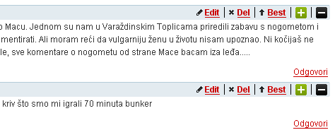
Front end administration of comments enable admins to solve problems on the spot.

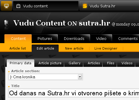
Big innovations were made in the Vudu backend allowing journalists to write articles, send them to proofreading and additional editing without any fears that the production line will be broken or that the article will suffer some damage on the way. As soon as someone enters into article, it locks and can be edited by only 1 person at the time. This prevents that changes that were made by one person get overridden by someone else. With tons more featured added to the Vudu, the little menace can now handle complex news portals with ease.
Just a small shot of Vudu powering the backend.

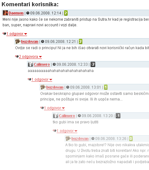
Frontend also received some pretty smart items raising the standards to the new high. One of the biggest innovations, that we so far could not find anywhere on the web, is the “Reply & Alpha™” commenting system. Most of the sites enable users to add linear comments to the article. Since Sutra.hr is pretty heavy on user comments, we had to allow users to communicate with more meaning, so we enabled Reply to an individual comment. By itself this also is nothing too new, Digg introduced Reply on comments a few weeks ago as well, however, due to Croatian temper (hot hot hot) we had to limit the depth of replying otherwise flame wars could go on forever. So, we came up with an idea to start making each depth more and more transparent in order to discourage users in endless flaming. Resulting, users say what they have to say on the second or third depth level, seeing that the more they prolong, the less visible and less noticeable their comment is. Users figured out this, and it is working really well so far.
Going, going, going, gone on the level 7 with HTML/CSS, not Photoshop

In the next updates we will introduce more cool stuff to the commenting, one of the biggest being the ability for users to make zero-level comment branches with all of it’s replies “sticky”, so that the whole branch appears to a user on the top of first page of comments. Basically, users don’t have to dig through pages of comments to find conversation that they follow, instead they can just pop it up to first place. Nifty stuff, eh?
We will keep you updated, since this is growing into one kick ass project.


3 thoughts on “Sutra.hr – innovations and complexity”
June 9, 2008 at 20:02
Hm it is in Croatian but it looks hella good.
October 8, 2008 at 04:08
Hi!
I want to make better my SQL experience.
I red that many SQL books and want to
get more about SQL for my work as mysql database manager.
What would you recommend?
Thanks,
Werutz
October 8, 2008 at 13:51
I can recommend only one book on subject of mysql – http://www.amazon.co.uk/gp/product/0596101716?ie=UTF8&tag=nivasnewmedia-21&linkCode=as2&camp=1634&creative=6738&creativeASIN=0596101716
If you are working w/ ms sql or oracle, then there is tons of other books available.