Double billboards and failed designs
I want to a car wash today because looking through windows gave me feeling that Mud People are following me everywhere. Right next to car wash I noticed this double billboard, and it took me a while to figure what message is trying to be conveyed here, and once I figured it out, I had a good chuckle.
Here is the picture:

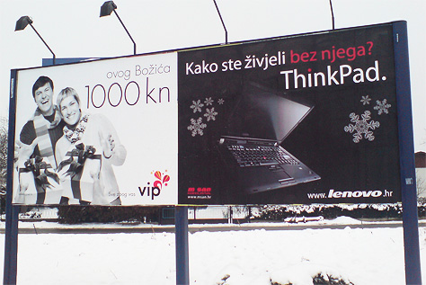
Since most of you do not speak Croatian, the White one says “this Christmas” and underneath in bigger font is monetary value “1000kn”. The Black one says “How could you have lived without it?” and underneath in bigger font is “ThinkPad.”
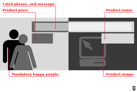
So, lets start with my usual intellectual rant. This 2 billboards actually look like they are one. They use same color scheme, similar fonts (untrained eye would call it same fonts even) and similar placing of data. The White billboard does not have any object on it, and that is epic fail for commercials: advertising something and not clearly displaying it. The alignment of text is a bit flawed, but both messages, if you include big text, rest on the same baseline making it a solid block of text.
Due to grammatically wrong message in the White one – sentence starts with small letter and does not have any interpunction it – messages combine, thus creating “this Christmas How could you have lived without it?”. It is a bit flawed, but has question mark in the end making it somewhat correct.
And then, the White one has price, and the Black one has name of an object – “1000kn ThinkPad.” Again, due to interpunction in the Black one this message is correctly written.
Of course, the illusion is heightened by having Happy People ™ on one side, and image of product on the other side. Also, word Christmas on the White one is enhanced by snowflakes on Black one.

Maybe if White one had grammatically correct wording with capital letter and colon, “This Christmas:” they would separate more.
On the sidenote, White one is commercial for telecom (VIP, essentially Vodafone), they are giving away 1000kn to their users. But the message is so retarded, and visual identification is of epic fail proportions. Most older people will not recognize that this is telecom marketing because people do not associate telecom by their small printed name, but by their NUMBER. When my mom wants to buy refill for her mobile phone, she does not ask ” … give me VIP refill card … ” she asks ” … give me 091 refill card … “. She couldn’t care less what is the name of her carrier, but she knows the number.
I do agree that this is just a coincidence, however, even if you separate this 2 billboards, the White one fails to convey the message miserably, and Black one does not have product price on it (this could be company policy, but still, I want to know the price of this magnificent product, show it to me!).
I have a clean car now! Woooooooo!


One thought on “Double billboards and failed designs”
January 3, 2008 at 17:40
I remember seeing two billboards one next to each other for two competitive political parties here in Zagreb in the time of elections. That’s coincidence! :)