Importance of Conistency
So anyways, I am in Sweden for the past 2 weeks, and as such, I got to work on a few occasions on Microsoft Windows XP localized for Sweden. Basically I had to fix half dead Win XP by removing some crap software, installing some good software, and see how are the things under the hood. I do not speak a word of Swedish, so it was pretty hard doing that by using just:
- intuition
- memory
- reflex clicking
Now, what I came to realize after few sessions with Swedish Windows is that Consistency is mother of all complex design. I am not talking just about visual design, or just about graphics, I am talking about logical placement of objects in menu, placement of buttons on applications, order of menus, and things like that.
Let’s hit the examples.
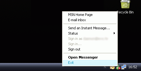
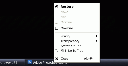
When you Right click an application on your task bar (hello Mac “my-mouse-has-1-button” users), or in your system tray, the first link from the bottom should close the application.


However, working with some crazy applications here localized for Sweden, I often got completely dazzled. Right click on it, click first link from below, and BOOM, something happens, and application is still running.
Next thing is the location of buttons. The most common location for the most common buttons should be like it is in the Properties of your Desktop (right click desktop > Properties). So, it is [OK] [Cancel] [Apply]
![]()
Yet however, I was surprised how many times developers play with those buttons and reorder them. By clicking the further most right button I managed to, on few occasion, screw up my work, since it was not Apply button, it was Cancel button. Hooray!
Same goes for the buttons during installation or removal of software. Most softwares have this layout for buttons:

On occasion, the [Help] button is not present. And again, it does not fail to amaze that some developers think this system is too old fashioned, and reorder buttons, remove little Arrow > marks on Next, and similar. I had trouble removing some of nVidia’s software because I could not find the proper button on it’s designated logical place.
Also, one of the problems I encountered is finding “Accessories” in the Start menu. Since I use English version of Windows, that folder is always on top and I just never thought that it can be anywhere else. Until I found out that in Sweden “Accessories” are “Tillbehör” and are placed god-knows-where in the Start menu. System tools should be separated from other software, not blended in. Like this:

I know it is not often that you have to work blind, but trust me, once you have to, you learn to appreciate Consistency of design.

