Windows Live Hotmail total catastrophe
Heya boys and girls. If you are using MSN messenger, like i am, then you might have noticed new banner on the bottom of it. Microsoft is advertising an upgrade to Hotmail, now called Windows Live Hotmail. So, i clicked on it, just for the fun of it. And was i amazed, or what?
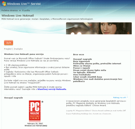
First you get greeted by a localized version of a landing page, so in my case – Croatian version. I cannot tell you how WRONGLY translated any and all software is that i saw translated to Croatian and i bet similar thing is with most of the localized software. I prefer English versions of software, and landing page does not have an option to switch language. Please keep track for how long will i NOT have a chance to switch language (i mean, the language detector could be wrong!).
(CLICK ON IMAGES TO ENLARGE THEM)
—
Alright, so lets say i want to create account and login to this new amazing email.
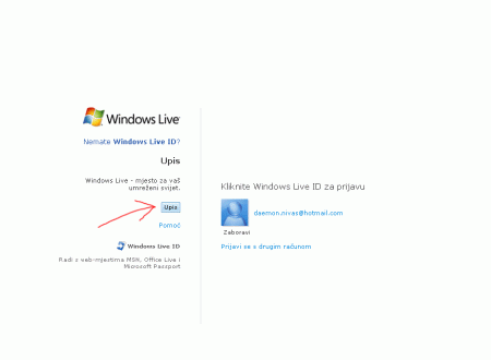
We are at the first screen: it has two sections, left of the line, and right of the line. On the left is “Create new account” section, with FUNNY SMALL button that gets me started with registration process. What the hell? If you need to attract the user to start using your new service, you do not put button 10×10 pixels small, you make it attractive and big!
—
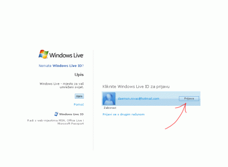
Where on Earth is the login box if i already have an account? There is none? Oh, no, there is, but you need to ROLLOVER it for button to appear! Armmmm, is it just me or this is so unusable that it is actually painful? Hidden button to log in! Some designer at Microsoft actually gets salary doing this, you know?
—
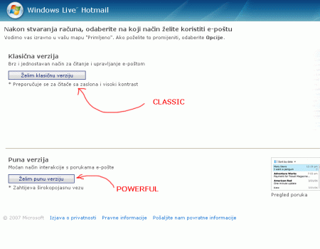
OK, so i either registered (registration form is more or less OK) or i have an account, so i logged in. Now i have to choose which version of Hotmail do i want, the stripped down one, or the full powerful one. But the powerful one is positioned LOWER. If you invest so much time in a new powerful product, then position it so – on top of classic one!
—
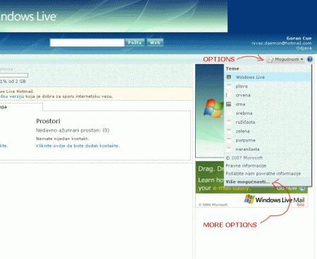
So i picked the advanced version, prepared to be amazed. In search of language switcher, because i could barely stand to look at stupid Croatian translations, i first went searching how to switch language. Options > More options > Change language. My god, i need to dig through bloody options in oder to switch languages. Usability, lesson ONE – users need to be able to read or change language of your site INSTANTLY, not after 10 page reloads and different settings.
—
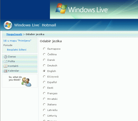
Of course, once i got to language selector, it was there in Alphabetic order, but English was not bumped to the top. How any normal designer would have done it, is put English, Chinese, and Croatian (since browser detected it) on top, then put line, and then the rest of the languages in Alphabetic order.
—
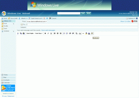
Alright, now i switched to normal language, now i can start using this amazing email software. First thing, let’s check how to write emails. Well, click “New Message”, doh. And this is what you get.
—
Just in case your eyes are not so quick at making out details (as are my trained “Lazer Eyez 2000 Super Plus”), i will point the things out for you.
—
Microsoft just released Vista, and in Vista they introduced (finally) cool looking icons. What the HELL are this icons then? Who authorized usage of this? Someone actually said “Yea, good job mister designer, we will go out with this icons, here is a pay raise!”. Let me zoom in onto them, check them out in full glory:
—
Anyone who was ever doing any pixel work is now most likely throwing-up lunch, i apologize for that. But, let me show you, just one more time this Smiley Microsoft used, it feels so “Beginning of the Internet” it is unbelievable:
—
At this point, i just stopped this and went doing something more constructive. Sleeping or something.




2 thoughts on “Windows Live Hotmail total catastrophe”
August 3, 2007 at 10:46
Go girl you tell em how it’s done. Damn Microsoft, they think they’re so smart, they just don’t know…
August 3, 2007 at 20:10
I mean, seriously, the software runs smooth, i bet it sends emails like CRAZY, but how unpolished it is, it is horrible.