The little Android Ideos
Our friends at the bonbon network, knowing my deep hate for Android phones, have sent me this little phone.

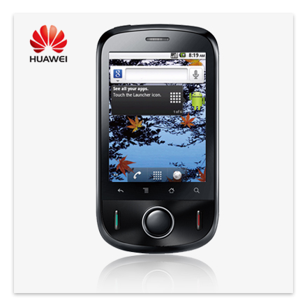
Ideos, by Huawei.
Apparently, it is a joke on their side to send me one of the cheapest (if not the cheapest) Android phone to try to combat my iPhone 4. But, I went open minded into it.
ABOUT ANDROID ON IDEOS
Little Ideos comes with Android 2.2.
Obviously, I know nothing about Android as an operating system. It took me a good hour to get used to the hardware buttons for “back” and “menu”. Once I got used to this, it kind of felt OK. But there was still a problem that even inside each application those buttons worked differently. If you are on the starting screen of Twitter the “menu” buttons does one thing, and if you are inside a single Tweet it opens up a different set of options. I guess this has its good sides and bad sides. Good is that the application itself does not need to incorporate those buttons in the UI as they are omnipresent on all phones, but bad is that you never know what exactly will happen when you press them. You have to go screen by screen of each application and discover what options are available on that screen.
The notification system on Android is supreme. Seeing that iOS does not have a system as such, it is a battle that is won by default. Pull-down panel with all the notifications amazed me.
But what I really liked is that Ideos does not come preloaded with crap. Every time I read about some new Android phone there are usually words like “bloatware” and “why the hell would they change the OS so drastically and put all that junk in it” present. Ideos comes iPhone style: bare minimum and ready to go.
It seems that screenshotting is a big problem for Android to incorporate it on a system level; instead you have to download an application to do it. And them, it turns out you need to have root access for those applications to work. Well not for Ideos! The ShootMe worked fine even without root.
Screenshot was necessary to show you the horror of the Android:
![]()
Pixels, do you bloody Android “designers” know what they are?! Screens use pixels, align your crap onto them!
The lack of final polish is one of the reasons I will never switch to Android. Whoever concluded that this is good enough UI to be constantly displayed to user should reconsider career.
ABOUT IDEOS ITSELF
The phone is well built, it is not squeaking when you apply pressure or twist it, and it feels solid. It feels that it could survive a few falls and not complain. It is really lightweight and feels good in hand.
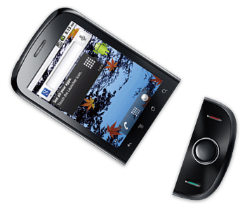
But I personally have one big issue – the bottom part of the phone is useless. All the actions can be performed through touch screen, there is no need for the hardware buttons. When you receive a call, the interface is on screen as well, you do not need to press the green button to answer. And, except to wake up phone, I haven’t pressed the middle button once. Maybe if you are a hard core gamer these hardware buttons mean something to you, but for everyday use – the bottom part of the phone is dead weight.

The responsiveness of the touch screen, and I am not telling children stories here, is on the level iPhone 3GS. It is really smooth. I held in my hands some other Android phones (mainly from HTC) and they felt sluggish and lacking frames. Little Ideos is smooth as butter.
The camera takes nice photos on the daylight, but the sound the camera makes is horrid. It’s like a mix of bear roar combined with buzzing of angry bees stinging you in the forehead. You cannot turn it off, but luckily if you reduce the volume with side rocker-buttons to zero, the sound does not trigger.
Battery life is solid, but once you install all the funky applications that want to communicate with the internet all the time, it can get a bit dodgy.
In the box you will get blue, black and yellow back cover, so you can match it to your eyes. I am sporting yellow, of course.
THE BOTTOM LINE
Overall, knowing that this thing costs so little it could almost be packed inside cereal boxes, it is amazing. Yes, it has a few hiccups, but you can equip a whole 4 member family with Ideos phones for the price of one iPhone. The hardware feels great, phone runs smoothly, has no bloatware installed, and it is ready to run out of the box with the fresh Android OS. I can see how Android is taking the world through sheer mass. If you just are buying your first smartphone (welcome to the year 2011 you time traveler) or just want to check out if this whole Android thing-a-ma-jig is for you, get Ideos. If you hate it, well, it makes for a great door-stop since it is solid built.
And yes, in the foreseeable future I will not switch to Android. In this few days living with Android phone every question I asked was met with counter question “what phone are you using, and what OS?”. The fragmentation is just crazy; you cannot get a straight answer without providing tons of data prior to your question so people know exactly what piece of the puzzle you hold in hand. And then most of the answers were “well, I do not know about your Ideos, but on my insert phone here that works”. Oh, great, it works for you. Good to know. Basically it all comes down to the fact that every user has a unique phone (even without rooting it) depending on hardware, OS version installed, customizations to the interface… It must be wonderful developing for Android.


3 thoughts on “The little Android Ideos”
April 16, 2011 at 16:36
FYI, Android just like PC doesn’t come with predictable set of hardware but it has to support a wide variety of hardware and screen resolutions. That’s probably why those “horrific” icons are not perfectly aligned to pixels. Iphone comes with predefined resolutions you can count on and OS is well adjusted.
Most probably icons were drawn using vector images so they can easily be scaled for various screen sizes. And probably these icons are used on a variety of Huawei phones – simply rescaling them instead of drawing pixel by pixel for each possible resolution.
So it’s not entirely designer’s problem.
April 27, 2011 at 13:03
iOS applications need to adjust to at least three differnet resolutions (iPhone, iPhone Retina, iPad). This means that any good designer will create three sets of graphics. Looking at Android resolutions, three sets would be enough to have everything pixel-perfect. Lazy, that’s what they are. Lazy.
April 27, 2011 at 17:56
The problem with the non aligned pixels is the problem with the low end devices screen resolution and by that not the Android itself. Take an HTC Desire with latest 2.3.3 Gingerbread for example. 1000% and there is no trace of nonaligned pixels. Thx for the ShootMe app tip to help me prove it ;).