Category:
developers journal
Take care of your pixels – Youtube example
Youtube.com added some button to the user interface recently, and it is pissing me off so hard that I just had to post about it.
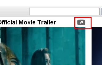
It is this button:

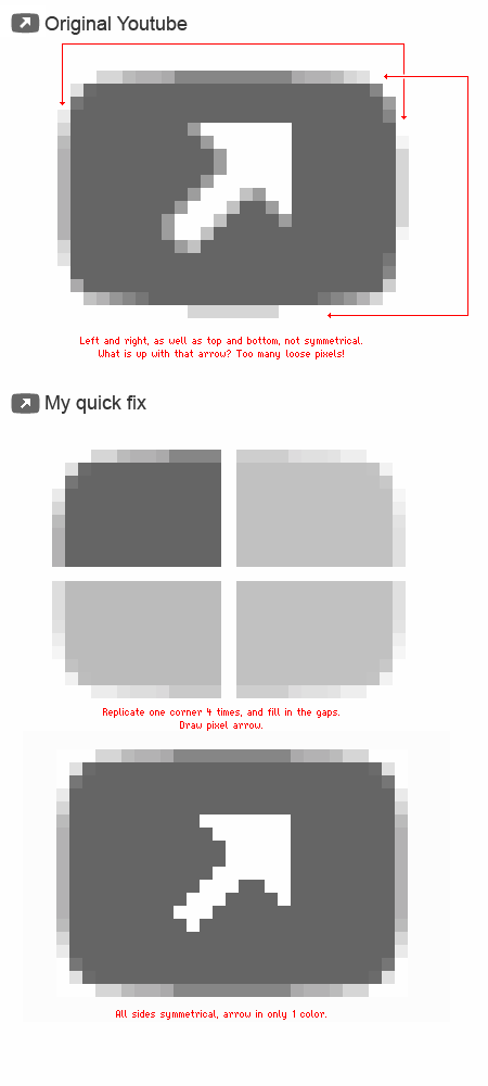
And I just cannot stand looking at it. The pixels are killing me.

And this is the laziest way that I could do it.
Also, to remind you about one more crappy pixel work on Facebook.

