White wallpaper on iPhone
I recently had white iPhone in my hands and just for test I wanted to put white background on Homescreen. Just to see how would an all-white device look like.
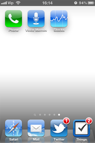
Check this out, this is a screenshot (reduced to 50% pixel size) of pure white wallpaper set as background.

Crazy stuff, eh?
So, what iOS adds is this:
- hard drop shadow on icons
- hard drop shadow on App name
- super smooth and very blurred drop shadow behind each icon
- gradient over whole background with light gray at the top (look carefully above icons, it is not white, it is light gray)
- leaves middle part unchanged
- hard gradient at the bottom, I guess to emphasize the bottom 4 icons
- of course, reflection of bottom 4 icons
This is not so visible when you are using your everyday wallpaper as it is most likely dark, but even in those dark wallpapers (unless they are completely black) you can notice these additions. Try scrolling between screens slowly and you will see the blurry big shadow behind each icon move. And this pretty visible bottom gradient becomes more obvious now that you know it is there.
It is pretty neat that Apple tries to increase visibility and architecture of interface as much as possible no matter what wallpaper you use. The icons will always stand out, and the bottom row will always be emphasized.
(But, yes, I have to agree that it would be cool if you could turn off this overlay somehow.)
Update:
Here is the full list of images that interface overlays on elements. Found it here.
WallpaperGradientLandscapeBottom – The shadows at the side of the wallpaper.
WallpaperGradientLandscapeTop – The shadows at the side of the wallpaper.
WallpaperGradientPortraitBottom – The shadows at the side of the wallpaper.
WallpaperGradientPortraitTop – The shadows at the side of the wallpaper.
FolderShadowBottom.png – The shadow present at the bottom of the folders
FolderShadowTop.png – The shadow present at the top of the folder.
FolderShadowBottomNotch.png – The shadow that is inside the bottom arrow of the folder you opened
FolderShadowTopNotch.png – The shadow that is inside the top arrow of the folder you opened
SBBadgeBGMask.png – When you open a app, the notification is pushed.
SBDockMask.png – Reflective dock
spotlight-full.png – The shadow that appears whenever a notification is received.
spotlight-keyboard.png – Similar to spotlight-full, but happens when you use the keyboard.
SwitcherIconShadow.png – Shadows present underneath the icons in the Multitasking switcher
SwitcherShadowTop.png – Shadows present underneath the icons in the Multitasking switcher
WallpaperIconDockShadow.png – Shadows under the dock when Homescreen wallpapers are enabled
WallpaperIconShadow.png – Shadows under the icon when Homescreen wallpapers are enabled
That is just scary. The amount of graphics which you do not even notice, but they are here to make sure everything is neat-o.


2 thoughts on “White wallpaper on iPhone”
February 8, 2011 at 20:21
I must confess I kind-a expected this kind of perfectionism from Apple. A lot of stuff, I as a user don’t even have to know about (and don’t), that makes the whole experience as smooth and natural as possible.
So, not really surprised, more like thankful :)