iPhone Application vs. iPhone Website
Today I have deleted 2 very good iPhone Applications and replaced them with Homescreen shortcuts to mobile, iPhone optimized, versions of those sites. It’s simple – web versions are just better! First one is New York Times, second is Facebook.
![]()
(i just hope Facebook Developers figure out they can use iPhone favicon =)
New York Times
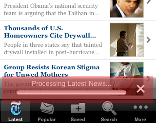
The App just takes too much time to load and to process data. They have even added the X button in case you do not have 5 minutes to sit and stare into progress bar even when you are downloading via Wi-Fi broadband.

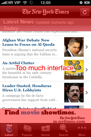
On top of that, pretty big chunk of screen real-estate is taken up by unnecessary interface elements, and by permanently positioned banner. I know that marketing is important, but permanent banner is not the best solution. There are vertical 190 pixels of interface and vertical 270 pixels of actual useful data (40% wasted vs. 60% useful) – not good.

As a total contrast to that, mobile version of NYT ( mobile.nytimes.com ) website loads super fast, banners scroll away, and there is no interface to speak of. For reading news – a bliss!
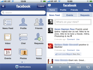
I will not go into details with this one. The App is bloated, feels heavy and is buggy. iPhone optimized website was recently updated and is just awesome. It is blazing bast, feels much much lighter and is actually easier to use than App.

Having mobile website and application at the same time is just too much competition inside the same house, and so far what I have seen, in that duel – website always wins! Mobile website is housed inside Safari, and as such allows for easy switching between sites, and links that you might have clicked on those sites. Furthermore, anyone can access your mobile website, whereas iTunes account is needed even if you want to download a free App.
One more really good thing, looking from developers aspect, is that you can change your website any time you feel like it, and skip all the drama with submitting your application to Apple and wait till it gets approved.


2 thoughts on “iPhone Application vs. iPhone Website”
October 8, 2009 at 16:10
i agree the NYT app is very clunky and takes forever to load content. I prefer the Chicago Tribunes..a lot lighter, and easier to navigate.
July 9, 2010 at 20:13
is there a sort of internet bookmark for Mobile Webistes?.;: