Business.hr is closing down
Business.hr – Croatian’s website that deals with, you guessed, business related news is getting closed down soon. It is one of the visited sites in Croatia, so I guess this is a big deal.
(I will not link it from here, because the link will be dead pretty soon, and I am too lazy to remove it when site closes down.)
All the major news sites reported this news, made a lot of comments about it closing down, but all of them failed to report the obvious – Business.hr is a website that is VERY hard to use and read.
So lets get the numbers going.
Google Analytics placed on some of the most corporate/business websites that we made give us this breakdown of monitor resolutions:
Croatia Osiguranje:
1024×768 – 39.09%
1280×1024 – 28.23%
SAFU.hr:
1024×768 – 33.69%
1280×1024 – 25.75%
So we can see that business & corporate related projects have 1024×768 resolution as the most common resolution to visit those websites.
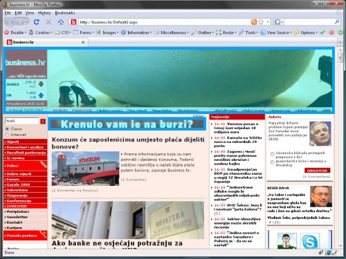
I have resized my Firefox to the 1024×768 pixels, and closed all the toolbars that ordinary people might not have, just to be on the safe side. And see how the website looks like (i marked BLUE the area reserved for banners):
The Homepage:

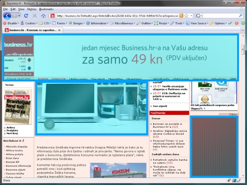
Worst case scenario (that occurs often):

I did some math on the pixels, and Homepage has a total of 588000 visible pixels (approximately, of course). Out of that 224480 pixels are reserved for banners (and irrelevant content), and that is almost 40%. FORTY.
Let me say that again in another way: 40% of the website is ignored by the users.
(I will not even go into further analysis – business people who most likely have Internet Explorer with at least 2 toolbars installed, out of the plethora of choices: Google, Yahoo, MSN, …. further reducing the view size)
Also, when you scroll the site down, entire header remains static, sticky at the top. Yes. Entire top blue section stays there no matter where you go on the site. I am not joking. No, no, no, seriously, entire top HUGE banner area stays there all the time, taking up about one third of your screen all the time. Seriously!!
When this website was made, this maybe was cool and innovative thing. However, since then, a lot of progress was made in the web design field, and this is no longer acceptable by the users. Users will just not spend time on this site, there are other sources of information that are more user-centered and better designed.
Furthermore, the design gimmick – having a HUGE ASS banner on top of the site causes one more problem. That banner is non standard format. 848×179 pixels is just out of nowhere. This causes problems with banner distribution mechanisms, since all marketing agencies that run campaigns for their clients need to make one more banner format for Business.hr specifically. Which often results in Business.hr not getting revenue from banners. Having a classical 728×90 banner on the top, that scrolls with the rest of the site, would be much better. No, actually, that could save them. But who would ever listen to experienced web designer, eh?
This just shows us, once again, that web is an evolving medium. Whatever website you made few years ago, it will probably not please users if you do not evolve it constantly. Listen to users, listen to designers, listen to web developers.


6 thoughts on “Business.hr is closing down”
February 24, 2009 at 18:13
Nice analysis. Basically, the biggest mistake is having the banner always at that position and obstructing the user’s view of the content. I thought iFrames died a decade ago. :)
February 24, 2009 at 18:36
Well, I utterly agree with your critique. On the other hand…in case you didn’t know, there’s site of the same design in Slovenia – finance.si (well, they got the same owner, mwahaha). And I know that sales crew up there has no trouble selling that HUGE ASS banner;) And all the rest of irrelevant “content”. Yet, users still happily click and read the site, obviously (according to statistics=)
Compare http://www.soz.si/uploads/MOSS_Jesen_2008_Dosegi%20z%20opombami.pdf to
http://www.soz.si/uploads/pdf/moss_jesen_2007.pdf =)
Btw, having a blog on a black background isn’t very pleasing to your readers either=)
February 24, 2009 at 19:53
:ave:
It’s like that Make my logo bigger thing :)
of course that business manager knows more about web that experienced web designer
February 25, 2009 at 01:55
business.hr was doomed to die when they released it. and they released it in 2007., not 2000 as you may think from Daemons post. :)
frames, SEO…? Hello?
March 1, 2009 at 01:12
I used to follow business.hr sometimes in paper format, but mostly on the web. They used to have great web I may say, but when they redesigned it become bad. I even sent an e-mail to web master suggesting to remove that banner coz I wasn’t able to read site, at least not in comfortable way. I never got answer. Yes, just until recently I had 1024×768 resolution on my laptop. That was a big mistake in their marketing strategy.
Personally I consider business.hr a great newspaper because they were sharp and objective. But now, they’re leaving our market for one great (and rare for that matter) newspaper less.
May 6, 2009 at 14:21
Great post! I did write about similar issues regarding slovenian site finance.net (http://formitas.si/blog/lenart-rudel/2008/02/financenet-so-res-samo-okrog-financ). I think it’s sad to see companies making web pages and turning them into banner gallery as soon as they get enough traffic. I believe there are ways of generating profit from web sites and still deliver value to users without making them suffer much. There are lots of pages where you can clearly see that they completely forgot about their users and that they main concern is generating revenue. When I see a site like this I just stop visiting them.