Oh-noz Space
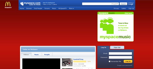
Last couple of weeks I kept hearing about upcoming MySpace.com redesign. Well, it came.
I don’t know if it is only me or what, but can somebody explain to me why did they leave a hole in the center of the site? And how about ever present position: fixed; McDonald’s banner? Nifty. “I am NOT lovin it”. :)
I really never ever liked MySpace, quite opposite in fact. To me MySpace makes Geocities free hosted websites look good. :) So much trash in one place….at the same time! I can tolerate awful background images ppl can put into their profile, I can try to avoid epilepsy by ignoring blinking bling bling animated gifs, insane colors and tons and tons of flash slideshows… but mp3 player is where I draw a big fat line. Man, I can’t stand hearing all that garbage ppl put in their playlists.
I wonder if makers of MySpace really did want to make a trash site, or things just got out of control by itself? This trash quality is really hard to achieve and I give them respect for that.


2 thoughts on “Oh-noz Space”
June 25, 2008 at 13:14
The “hole” in the middle of the site is supposed to be for a large flash/animated ad, usually for movie/game/dvd/album releases and stuff. i see it fine here in the land of the free and the home of the brave ;)
Right now it says “Call of Duty, World at War” a first person shooter game. You dudes might dig it :P
my guess is that ads may be blocked for other coutries if the release will be later, or not at all with no local ad content to replace it.
just a guess.
—
but i tend to agree…this is one of the cases when giving people too much freedom just leads to bad choices…and bad design, and 99 percent of myspace pages are smeće
June 25, 2008 at 20:23
Ah yes, really. Now they removed McDonald’s banner and inserted big banners inside that hole.
I really don’t dig change of website background color. It’s slow and tends to be jerky on most machines.