Capital Branding crime in Croatia – PBZ
What i thought is impossible to happen in the year 2008, especially now that Croatia is filled with high quality, world class award-winning design and marketing studios – happened. One of the oldest and strongest banks in Croatia, Privredna Banka Zagreb (PBZ), rebranded overnight. Well, more like inherited branding from their new owners, but for the common folks out there, it makes no difference. It all happened in over 1 night, one day old stuff, another day, *WHACK* in the head, new visual identity all over the city.
This is the old logo, still in our hearts:

And this is the new logo:

New logo represents Italy’s aqueduct. And for a bank in Italy, this is seriously the coolest visual there is – entire Italy grew thanks to invention of aqueduct. Fresh water was being poured into city, and fresh water is fundamental for city growth. It keeps it clean, people can drink and bathe. Perfect for Italy. For Croatia? No way in hell.
I understand the will of new masters to force the new branding onto the general population, but this was done so brutally and so … raw … that design community of Croatia was left speechless. Let me explain this on few levels.
Level 0:
Here is what we think about the font used ( Trajan ):
And i quote: “Every single horror film made in the past 5 years uses Trajan”. They could have at least reduce the confusion by keeping old font.
Level 1:
Gjuro will explain the sentimental value soon.
Level 2:
New brand has absolutely no connection to old one. They could have at least localize the brand, and make it fully red, or rounded corners or something, and then in few years, roll out this full color version.
Level 3:
Bank’s interface is it’s visual identity. The fact that interface is the strongest point, and i mean THE strongest point in any brand is well known. You recognize iPods by their scroll wheel, not by their music playing ability – scroll wheel is their interface. You know that feeling when you grab someone else’s mouse, and it feels weird? Or when you drive someone else’s car, and you absolutely cannot control it until you familiarize with it’s interface? Yup, that is because interface, and how you use things, and how you connect with them – defines brand.
Bank’s interface is it’s logo. As simple as that. The most obvious example would be changing logo on the bank’s building. Did my bank move away? Are the selling colored lollipops in this building now? What’s going on?
Let’s say you walk into a shopping mall. There are 10 ATM machines there. They are all the same, except they got different logo on them. If you change logo on your ATM machine, it’s game over for people. I bet that PBZ call center is ringing like mad in the past two months, and will continue for some months. The confusion of people is staggering.
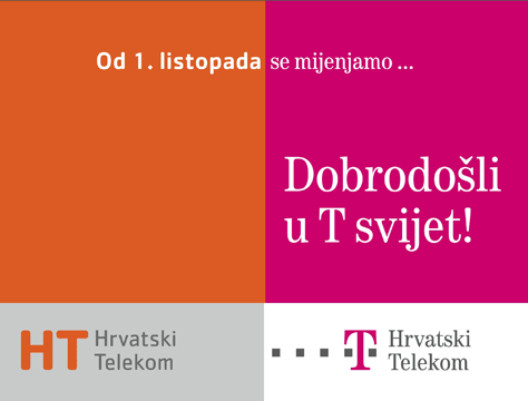
In comparison to this, we had Deutsche Telecom acquire our main telecom, and they rebranded instantly after purchase. However, their rebranding was led by some really smart brains, that for weeks kept this billboard on streets.

Orange was old color, T-Com magenta is the new color.
And then they added text:

This is my recreation of billboards, i cannot find originals anymore, but that is the general idea – show everyone what is happening in a clear and transparent manner. This was done so smoothly that since day 1 of rebranding people knew that magenta colored T-Com is what was recently their old telecom.
In the years to come, when you open up encyclopedia and look up word “FAIL” you will see PBZ rebranding case listed there at first point. But, that is what happens when bankers try to play designers, and completely ignore graphic rules, branding, logic, and common sense.
UPDATE:
The Agency ( Digitel ) that spearheaded rebranding campaign for T-Com sent us the original billboard. It says: “From the 1st of October | we change. Welcome to T world!”. That’s how you do rebranding.


5 thoughts on “Capital Branding crime in Croatia – PBZ”
May 27, 2008 at 13:30
Killer post mate! And I think we should publish a book entitled “Encyclopedia of FAIL” ™.
December 3, 2008 at 18:45
These same proffesionals obviously didn’t lost their job because of this. They FxCKED UP one of our banks too – http://www.vub.sk/
http://marketer.hnonline.sk/c1-22757640-vub-banka-meni-farby
(scroll down for old blue logo)
One day – BAM! – new logo & everything. I’m actually thinking of closing my bank account – I’m using it less and less because I “moved” to another bank few months ago. It will be nice to see their faces when I tell them the (not) actual reason is the rebranding.
Honestly – I don’t know how to do such “big” rebranding, but I certainly know how NOT to do it…
Nice site – I enjoyed reading, keep it up.
December 4, 2008 at 11:02
Hi Heretic!
Yes, I think that main problem is visual identity of their owner bank – http://www.intesasanpaolo.com which is pretty unpolished. Aquaduct in middle of logo.. hm hm….
March 15, 2009 at 09:02
Hi nice post, i have come across your site once before when searching for something so i was just wondering something. I love your theme, would it happen to be a free one i can download, or is it a custom one you had made? In a few weeks i will be launching my own site, i’m not great with designs but i really like the style of your site so it would be cool if i could find (or pay for) something with a similar look. :) Thanks!