Category:
developers journal
New Adobe.com is released
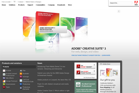
Adobe made new site. It does not have Adobe logo clearly displayed.
I will not even make comment about that.
Furthermore, the only logo on the site is placed close to RIGHT ALIGNED search box, meaning that if a user has wide screen monitor (as most of developers using Adobe products do) logo will fly so far to the right side that it will completely lose relevancy to the site. Effectively meaning – Adobe.com does not have ANY corporate branding on the site. Wait … what?
Screen capture:


3 thoughts on “New Adobe.com is released”
December 7, 2007 at 17:23
A very nice design it is. Readable, clear and subtle. Very nice.
December 7, 2007 at 18:17
Yeah, without obvious branding. On what site am i? Am i on a site of Adobe software reseller? Am i on a site that provides tutorials for Adobe software? I have no bloody clue …
Visible logo somewhere on top or top-left is a MUST of a good web page.